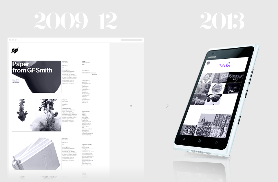
1. To redesign the portal to be responsive on all touchpoints.
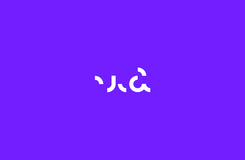
2. Re-introduction to distinguish "Via" as a brand on its own.
3. Create a system that allows maintenance & data entry to be easier.
The current portal lacked functionality for it to perform to its highest potential. Therefore every aspect from submission to content entry was addressed & redesigned from the ground up.
From a brand perspective, given the content is curated by myself, I created a brand image that would be distinctive from other inspiration sites with an element of personality.

Colour Directions

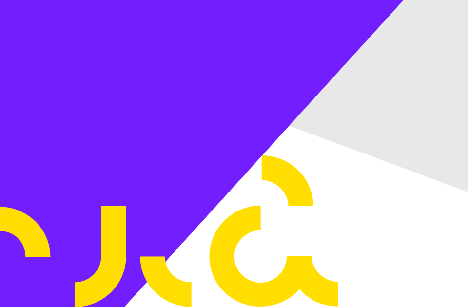
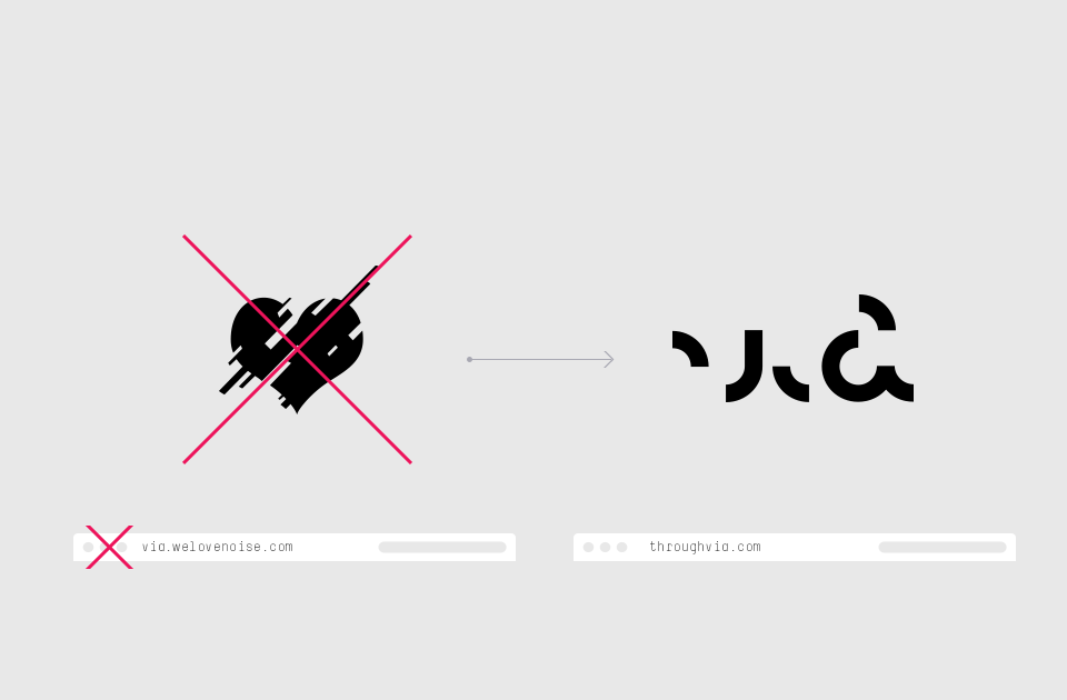
Re-brand & disconnection to the WeLoveNoise brand
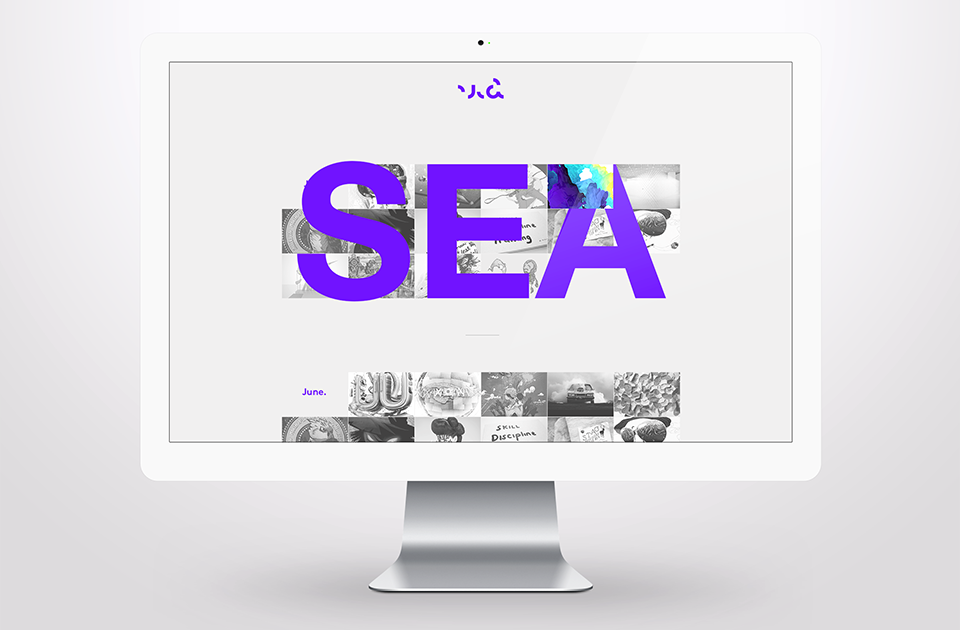
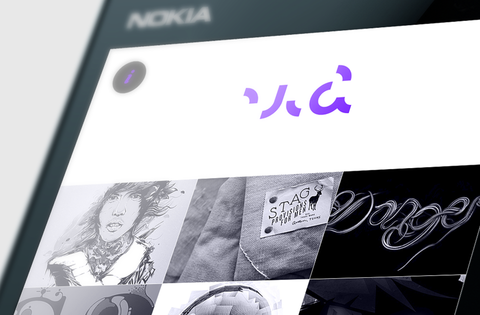
— Large type to illustrate studio/designer.
— Thumbnail transitions to full colour.


Considerations were made for posts having several images that may also vary in size.

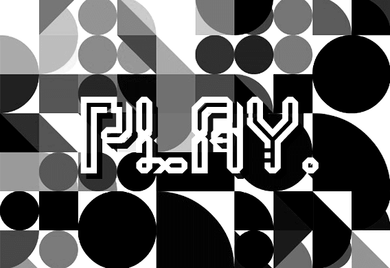
Personal work of mine is always designed to be experimental & playful.
The posts are the core content & so any other information is secondary & kept out of sight, but still easily accessible.
Via
visual design blog/portal that accredits talented designer's & studios from all disciplines of design.